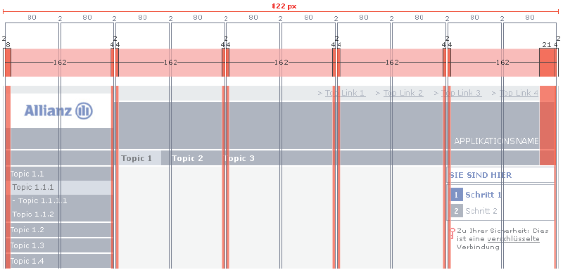
Grid

What It Is
Grid systems have long been a staple of print media, providing a consistent visual scaffolding or framework from which to build up complex and visually appealing page layouts. As noted on the Yahoo Pattern Library:
A standardized grid provides a consistent and cohesive user and brand experience with flexibility for the designer to incorporate common and dynamic page elements, as well as different ad sizes, for a large quantity of websites that are created and maintained by many individuals. A defined set of configurations will enable developers to reuse code and easily leverage existing modules.
When to Use
The grid is a fundamental building block for creating Allianz-branded application pages. As such, other page elements have been designed with the grid tightly integrated into their defined CSS classes. This frees the designer for the most part from having to consider the grid when designing individual web pages.
